

CATEGORIES: Branding, Packaging.
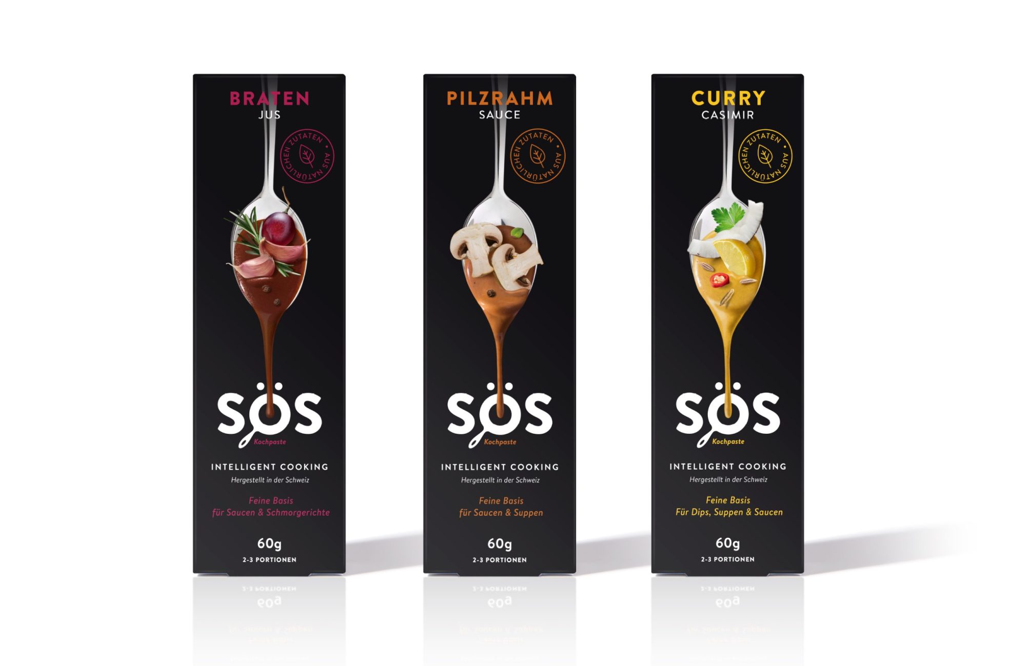
SÖS Gourmet Sauces are full of flavour and sophistication. Curry, mushroom and braten – a traditional roast flavoured sauce – hailing all the way from Switzerland and ready to use in everyday cooking. We needed to showcase all of this and more using an outer packaging functional design and a visual identity designed to take consumers on a gastronomic journey.
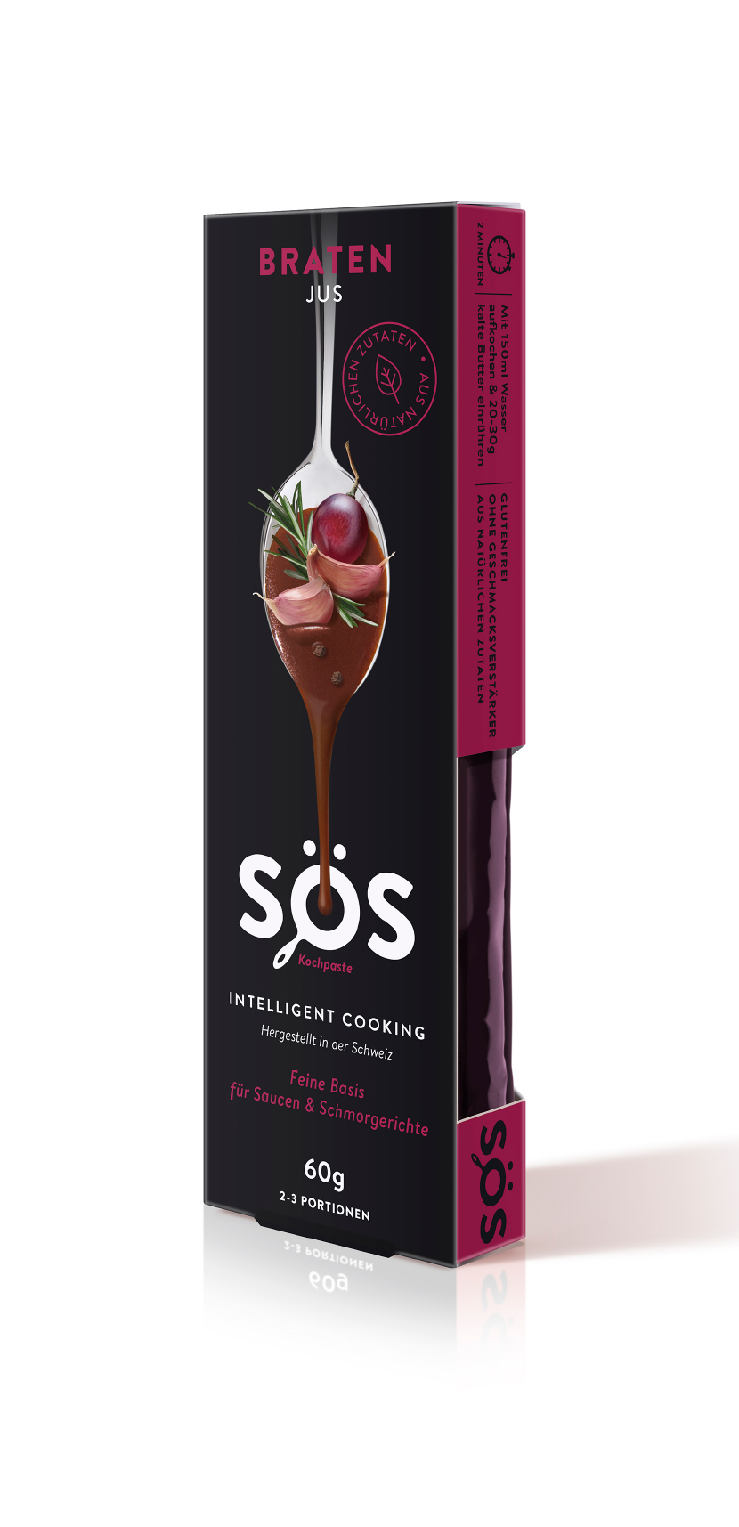
We chose to deliberately expose the intense colour and richness of each sauce through a purposeful die-cut window included in the outer packaging design.
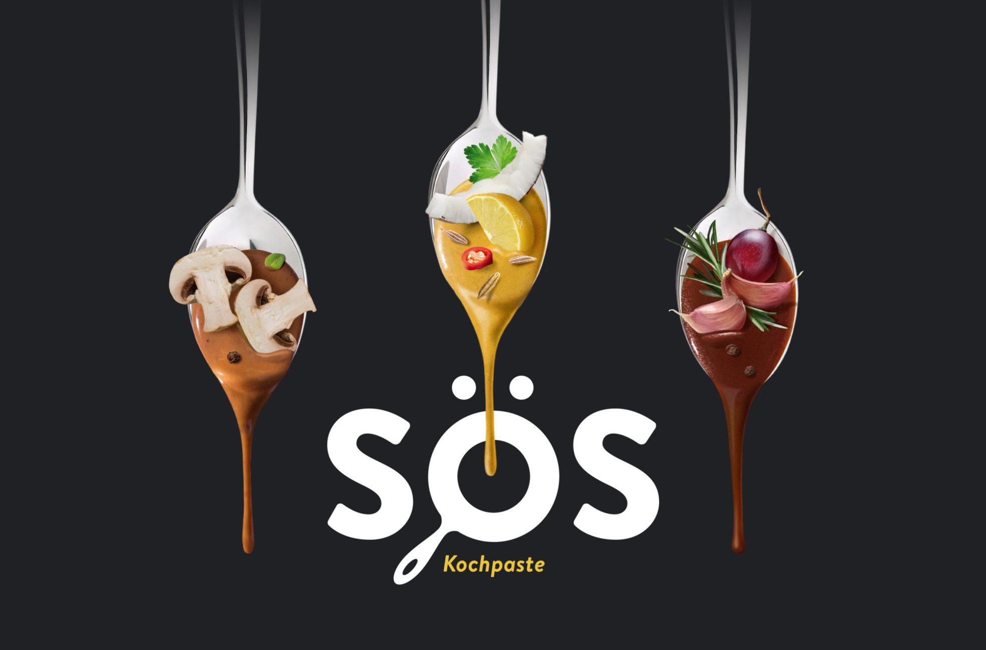
This combined with an image of a spoon on the front of the packaging, laden with sauce and the fresh, delicious ingredients used to develop these full flavoured sauces, revealed the complex flavour profiles on offer.
The SÖS brand, in particular the Ö, was strategically used to depict a saucepan. Gently flowing from the spoon into the pan, not only illustrates the rich, thick consistency of the sauce, it also demonstrates how effortless it is to use these sauces in everyday cooking in the comfort of your own home. Simply heat and serve.


